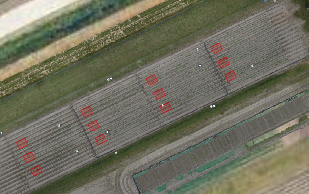
The Situation
A potato breeding trial spanning many small plots run in parallel. Every week during the growing season, a drone overflies the plots and returns thousands of RGB images. Canopy cover serves as a proxy for emergence speed and vigour, and it is needed at the individual-plot level, not as a field average.
Manual annotation was taking days per flight. Threshold-based approaches (VARI, ExG) crumbled in variable lighting, shadow, and as haulm colour shifted through the season. The pipeline had to be fast enough to turn around results before the next flight window.
The Approach
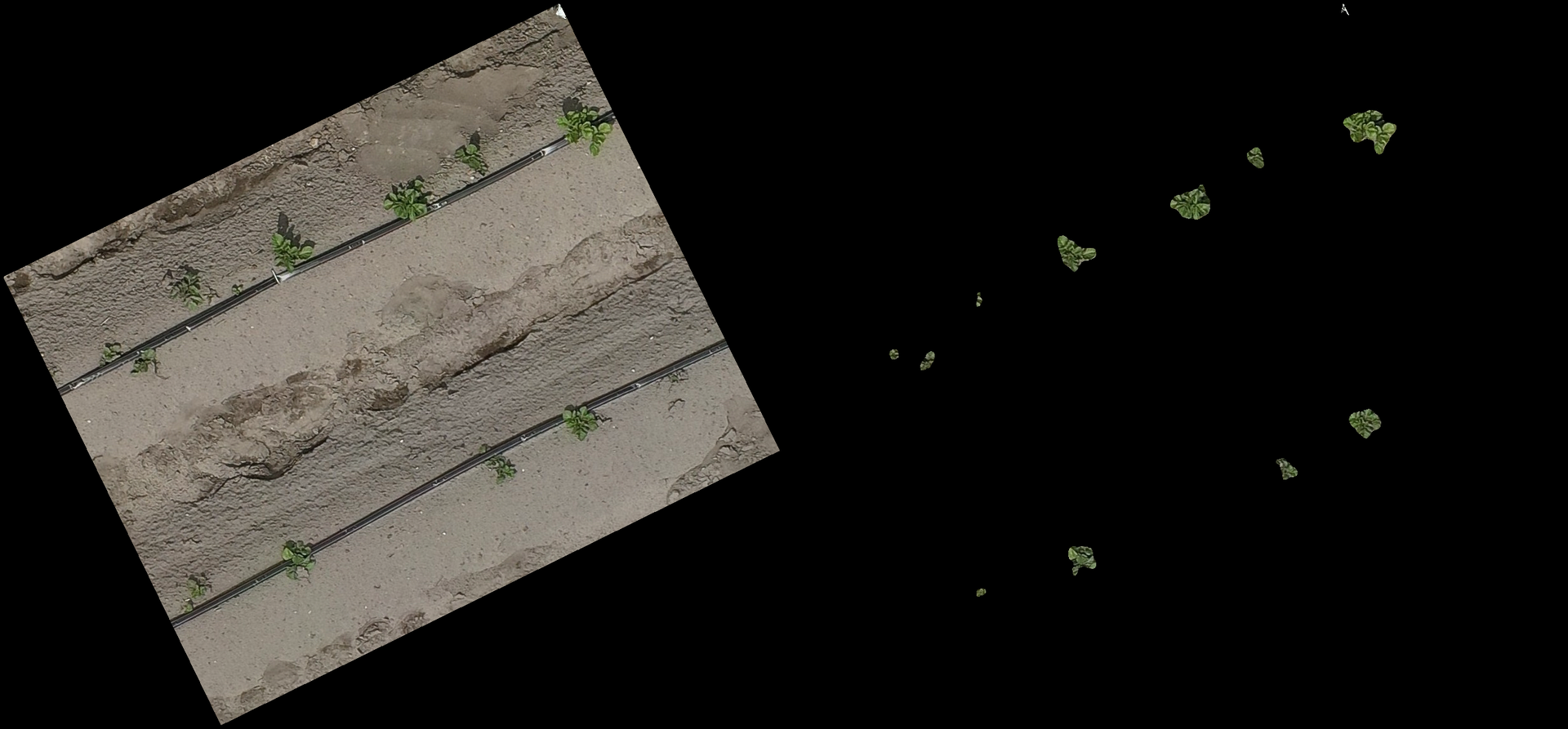
We started by building a small but clean training set. Using AnyLabeling with its SAM-assisted annotation mode, 150 representative image chips were labelled in two days, covering the full range of growth stages, soil types, and lighting conditions present in the trial.
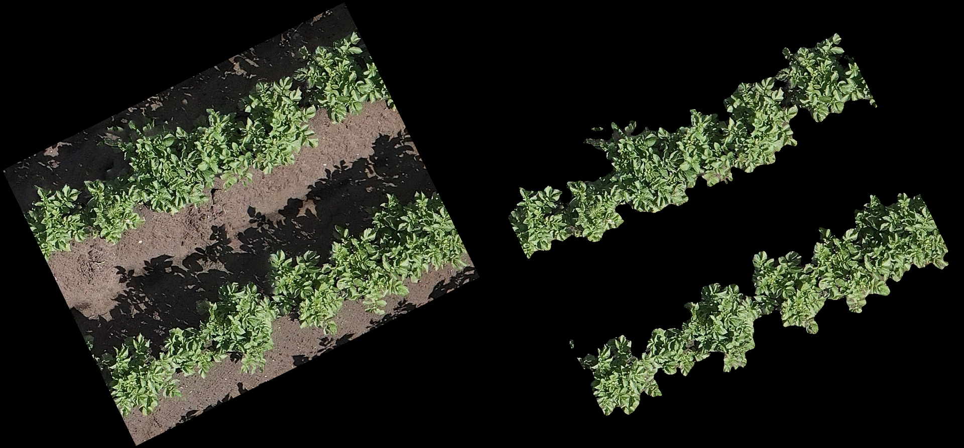
The classifier is a U-Net with a ResNet encoder, trained entirely on CPU. The architecture was chosen for its strong performance on small, well-annotated datasets and its tolerance for class imbalance early in the season when bare soil dominates. Training finished overnight.
The full imagery workflow runs through Metashape for photogrammetric stitching into a georeferenced orthomosaic, then into QGIS where plot boundaries are overlaid and each plot is clipped to its own raster. The classifier then runs chip-by-chip, returning a green-pixel fraction that is aggregated into a per-plot cover percentage and written to CSV, one row per plot per flight date.
The Result
On held-out validation imagery the model reached pixel accuracy above 95% and a Dice coefficient of 0.97 across the range of growth stages. The end-to-end turnaround from raw drone footage to analysis-ready CSV dropped from several days of manual work to an automated run requiring only a QA spot-check.
Because the pipeline is data-driven rather than rule-based, it generalises across potato varieties and adapts to seasonal colour shifts without manual threshold re-tuning. The output is a time-series table that drops directly into a downstream statistics workflow.